Introduction
This fall term, our CS 449 group consisting of Hongbo Du, Nino Ding, Wenyi Hu, Zuomiao Hu, and Nicole Qian worked on a product named proLearner, an online platform that seeks to enable informal learning while creating a more personalized experience for users with different needs.
In the modern day and age, people lead busy lives split between their career and family and find it hard to take classes in the traditional way via in-person lectures. As well, while in a traditional classroom setting, people may experience pressure from regularly scheduled assessments and judgment from their fellow students. However, when taking online classes, people find it difficult to form connections with their peers due to the lack of face-to-face interaction. Addressing the issues with classroom style learning while mitigating the shortcomings of online classes will let a more people learn what they want without being held back by the status quo teaching methodologies.
To accomplish this, proLearner offers online lessons in the form of pre-recorded lectures and slides along with short formative assessments at strategic intervals that the user can use to evaluate their own learning. Furthermore, our platform has a community system that features Q&A forums with course instructors as well as private and group messaging between users.
Throughout the term, our group gained valuable insight into the different parts of the design process. The following report details each step we took and showcases our final product.
Background
Our team began by looking into existing research on the topic of our platform. An article titled “Side Effects of Online: pros and cons in the development of informal online learning’’ helped guide our product design process by outlining high-level problems related to online learning. One critical insight it brought forth was the lack of connection between students while taking online courses which had a negative impact on both their mental health and academic performance. This inspired our team to include a community feature in proLearner that would overcome the major drawback of online learning.
An online learning platform is not a novel idea, and this can be seen in existing services such as Coursera and Udemy. The existence of such products served as a foundation upon which proLearner was built on. Many standard features of these services such as readily accessible pre-made lecture material and formative quizzes were included in our own product. One aspect that differentiates proLearner from the competition however is the focus on its community system and subsequent features. While Coursera and Udemy possess Q&A chats with course experts, they lack features such as a dedicated user forum that facilitates interaction between peers. This not only helps proLearner gain an edge over the competitors in the market, but also allows it to uniquely address the problem of a lack of connection that comes with online learning.
Value Proposition
After conducting thorough research and analyzing existing solutions, our team embarked on the empathy stage to better understand our user group’s pain points and desires. Through the value proposition activity, we discovered that our unique selling point is to enhance the benefits of informal learning, which allows users to learn at their own pace in a judgment-free environment. In contrast to a traditional classroom setting, informal learning will enable students to learn without the constraints of a schedule and the social pressure that accompanies in-person learning. Additionally, we identified that some users fear losing track of their learning progress and becoming overwhelmed by the amount of information available.

User Personas and Empathy Maps
To better understand our user group, we created personas and empathy maps to represent their needs and motivations. Each of the three personas we have chosen represents a person in a drastically different stage of their life. While all 3 of these personas wish to learn about new topics on our platform, their differing backgrounds mean that each of them has different wants and needs regarding the type of content they are interested in learning and how their associated courses are delivered. When creating our personas, we researched the demographics of current online learning platforms such as Udemy and MasterClass. This allowed us to identify different market segments for our product to focus on.
Meet Lucy
Lucy is a 27-year-old working professional with the time and money to pursue hobbies that she may have put aside for her career. She represents the demographic of adults who have been in the workforce for several years and have progressed in their careers. Regarding learning on our platform, Lucy may be interested in courses that can help her advance her career or improve her skills in a hobby. She may prefer classes that are delivered in a structured format and allow for timely communication with the instructor.
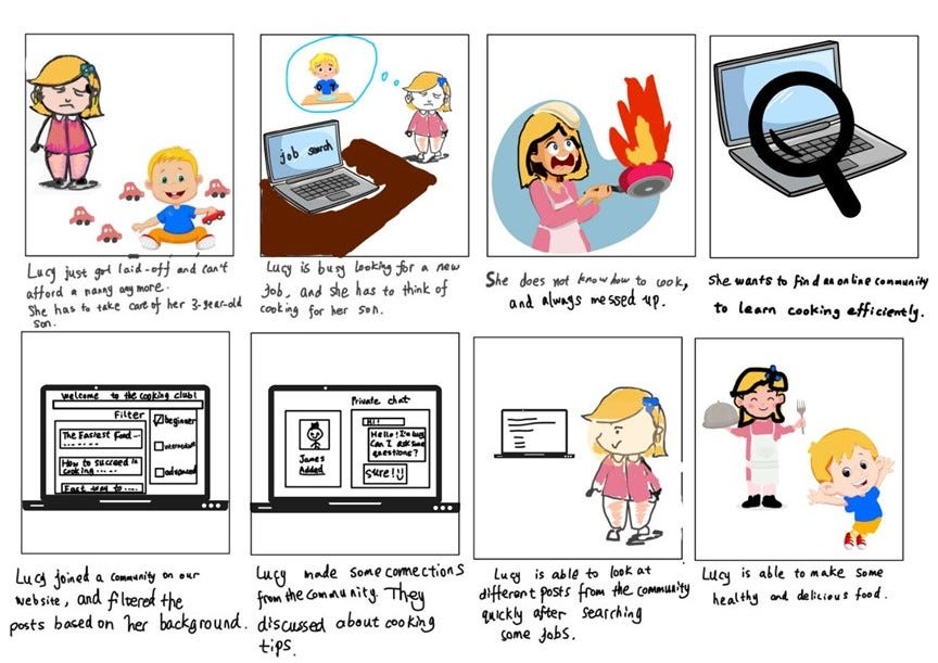
Meet Kate
Kate is a 37-year-old mother of three who represents the demographic of parents who want to enhance their domestic skills. She may be interested in courses on our platform that can help her improve her cooking, cleaning, or parenting skills. As a busy parent, Kate may prefer flexible courses that allow her to learn at her own pace. She may also value affordable courses that can be completed in a short amount of time.
Meet Alex
Alex is a 22-year-old college graduate looking to learn and enhance technical skills for the workplace. He represents individuals just starting their careers and looking for resources to support them. Alex may be interested in courses on our platform that can help him advance practical skills relevant to his field of work and extend his skillsets for his career path. He may prefer concise courses that offer a certificate or recognition upon completion.
Our research revealed that users generally seek out online learning for its convenience and flexibility, allowing them to learn on their own schedule regardless of their busy lives or learning abilities. Although the purpose of using informal learning by the User Personas differs from hobby to career-focused, a common pain point for many users is the difficulty of finding relevant topics to learn about, which often requires them to spend excessive amounts of time searching for information. This necessitates a recommendation system of sorts on our platform, which bases its suggestions on user-inputted topics of interest.
Questionnaire and User Interviews
To gain a deeper understanding of our users’ learning motivations and preferences, our team interviewed a diverse group of people from our network and volunteers we found online. Through this process, we discovered that most interviewees prefer to learn through video lectures rather than live meetings. While they appreciate the personal interaction between students and teachers, they feel more comfortable with a personalized learning pace. This insight allows us to address the common concern among users of losing track during their learning process. In addition, we also received feedback on the overall value of informal learning. Some interviewees were skeptical about the professionalism of our platform and expressed that they would only be willing to pay for the service after a free trial if they were convinced of our platform’s superiority compared to readily available online videos.
In conclusion, our research and interviews have shown that our user group values the flexibility and autonomy of informal learning but is concerned about staying on track and finding relevant topics to learn about. To address these pain points, our platform will offer a recommendation system based on user-specified interests and free trials to help users decide if our platform is a good fit for their learning needs.
Design
After our team identified the problems facing proLearner, we started brainstorming ideas and features we could introduce to solve these problems. A Miro board with all of the different individual and grouped ideas was made, and a vote was held to determine the key features to be included in the prototype.
Among all of the options, we settled on the following five features.
- A recommendation system where we can take the user-inputted area of
interest and return courses based on the aforementioned topics. - A formative evaluation feature consisting of practice problem sets and
optional project ideas would allow users to evaluate their learning. - An anonymous community feature that allows people to register for
courses and ask questions in any community anonymously. - A community feature allows people taking the same courses to connect
and chat with each other. - A Q&A system to achieve real-time and asynchronous communication
between course instructors and students.
Storyboards
Our team then created storyboards to represent user stories associated with these features to gather more insights about user needs, how our product can solve their dilemma, and how we can refine key features.
User Flows
After gathering more insights into user problems and how the five features can help solve them, our team created basic user flows and outlined wireframes for each design argument. After deciding the basic outline of our design, we chose the two most important features of our app to continue elaborating on.
Our team chose to prototype the community user flow and the Q&A user flow since we thought that these two features were the key differentiators of our app from other existing solutions. During our empathy stage, we noticed that a lot of users’ concerns are related to losing connections with other peers and not being able to ask questions in a timely manner. While existing solutions offer features such as a recommendation system, most do not include a community and Q&A feature.
Based on this activity, our team was able to better understand which layout is needed for the feature. We used insights collected from user storyboards and user flow to figure out what the user would want to see and use at different stages of the user flow. As we decided our screen layout and branding guideline, we kept in mind design principles such as consistency and affordance. For example, we tried to figure out why the user would be confused and why they would want to click the wrong button. To keep our design closer to other traditional UX flows, we checked the fonts of most iOS apps and borrowed ideas from other apps such as Reddit and Piazza for the community feature. The primary and secondary colors we chose are purple and light pinkish purple which are associated with creativity and wisdom. Throughout the design, our team aimed to create a straightforward user flow where people can reach out for questions and connect with other peers easily and quickly.
Final Design
Low-Fidelity Prototypes Evaluation
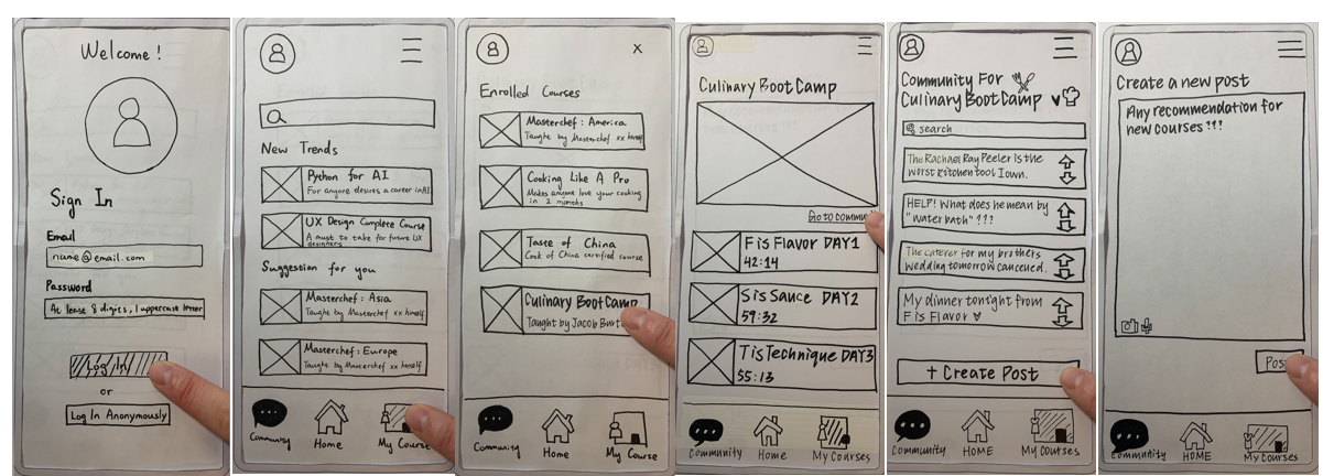
Paper Prototype
To evaluate our low-fidelity paper prototype, we asked participants to complete a series of tasks while we took notes about their confusion and hesitation and observe their reactions. In the original wireframe prototype, the overall user flow for the community feature was smooth, but there was some hesitation during the process. Firstly, users were not sure about the difference between signing in anonymously versus with an account. Secondly, they wanted to be able to sort posts according to the most upvotes while they were exploring the community feature. Thirdly, users wanted to have a way to preview posts that they were about to create before posting them. To solve these issues, our team added these functionalities in their respective pages. In addition, we changed the anonymous feature to “continue as guests” in order to simplify its function and make it more accessible and familiar to users.
Wireframe Prototype
In our team’s original low-fidelity wireframe prototype, the Q&A system worked as a real-time communication feature, which meant that students had to wait until an instructor came online to answer them. The participants wanted a way to find instant answers when the instructors were unavailable in an asynchronous manner. Thus, we added a “Common Questions” section under the Q&A feature, allowing our students to find useful resources before needing to inquire further. The “Common Question List” includes common questions that previous students asked about the current lectures, which are collected, and summarized by the instructor. On the “Common Question Page”, the instructor could post potential answer keys consisting of text, pictures, or videos. To emphasize the unique points of our Q&A system, we added a status symbol and a local time on the “Ask Instructor” page. This way, users can easily estimate if they are able to receive an instantaneous response and whether or not it would be more effective to browse existing answers to common questions.
Original
Updated
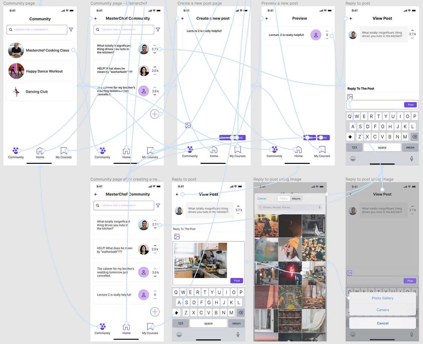
High-Fidelity Prototype Heuristic Evaluations
Two groups from our class completed our high-fidelity prototype heuristic evaluations. They pointed out limitations in the original high-fidelity prototype from perspectives of “Consistency and Standards”, “Aesthetic and Minimalist Design”, and “User Control and Freedom”*. *A group said they
couldn’t tell if the preview button was activated since it’s not immediately clear that clicking the preview button will exit the preview. There was also a misalignment among rectangles on the community page and the visual for selecting “Community” was inconsistent. “My Courses” and “Home” were filled in with purple, but “Community” had a shadow effect. Another group indicated that the bump on the selected icon in the navigation menu did not align with “Aesthetic and Minimalist Design” since it took up excessive screen space (filled purple icon indicates selection). Moreover, the number of points corresponding to a post by a user disappeared when viewing the post.
Resulting Design Iteration
Based on the findings from the heuristic evaluations above, our team made the following updates. To make our prototype consistent, we looked at all the pages and adjusted any misalignments, mispositions, and missing elements. To distinguish the activation status of previewing a button and to highlight its uniqueness, we created a separate preview page instead of simply adding an on or off status. When a user clicks preview, they will be taken to this page and can exit the preview by clicking the back button. A user can also edit the post on the preview page after clicking the newly added “Edit” button. We removed the bump on the selected navigation icon and made the community icon fill with purple upon being selected. In addition to addressing all the issues from the evaluations, our team made our prototype more professional in accordance with iOS UX design conventions by adding common widgets such as the horizontal bar at the bottom of the screens and using the default iOS keyboard layout. To further complete the user flow, we added pages to illustrate the effects of clicking photo gallery on view post and a textbox incorporating the selected image.
Original High-Fidelity Prototype
Q&A Feature
Community Feature
Updated High-Fidelity Prototype
Q&A Feature
Community Feature
Conclusion
In the design process of our product proLearner, there were several insights our team gained with regards to UX design. One of these insights was with regards to consistency of elements in our platform pages. In our original wireframe prototypes, the only commonalities between each page were the color scheme and icons. As a result, there was a disconnect in the user’s experience when they traversed proLearner’s various features. This is because although the core components of the prototype were consistent throughout, small differences in each page’s layout, font, and spacing reduced its overall clarity and usability. Upon revising our high-fidelity prototype, we created a detailed template for each page that was followed instead of being left up to each group member’s personal discretion. This resulted in a product that appeared as if it was made by the same person in one sitting and was much easier to interact with. Reflecting on this experience highlights the utmost importance of establishing detailed design specifications in the planning process of a prototype which proved essential in proLearner’s development and can be applied to the design of any other UX.
Another insight our group found was in the importance of drawing upon existing UX design standards specifically as it pertains to which platform the user will be interacting with the product on. The original wireframe prototype of proLearner had pages that were based on a generic interface design without regard to whether the user was an iOS, Android or web user. As a result, there were few elements in the prototype that were based on existing symbols that the user was most likely already familiar with; thus, reducing its overall accessibility and ease of use. In our revised high-fidelity prototype, our group made sure to establish that it was designed for iOS devices and as such, included common attributes of iOS apps such as status symbols on the top left and right and a home bar on the bottom. Furthermore, we chose to use fonts in our prototype that were common to iOS apps such as SF Pro as well as popular iOS icons such as the standard back and home button. This allowed the user to easily infer functionalities of buttons within proLearner and provided them a smooth and comforting experience. Our experience provides an important lesson for UX designers which is to keep in mind the device or platform the user will be interacting with their product on and use existing elements from that platform to enhance ease of use and familiarity.
In the development process of proLearner, our team focused primarily on its interface and core functionality while largely ignoring the feasibility of implementing its features. If proLearner were to be developed further, implementation of its various systems would need to be considered before deciding on their inclusion. Given the opportunity to continue working on proLearner, our team would need to begin coding its planned features during a preliminary stage in order to determine whether or not said feature should be included in the final design. In addition, it would benefit our UX design if additional rounds of heuristic evaluations were conducted in order to further refine proLearner’s interface.